Though it all feels like one big project, visiting and photographing 300 courthouses could hardly be more different than making a coffee-table book about them. The former is mostly a test of endurance and road trip route-planning. The latter is a hugely complicated creative and logistical endeavor. Sure it’s possible to order a simple photo book from Shutterstock, but this idea felt like it needed to be done properly or not at all.
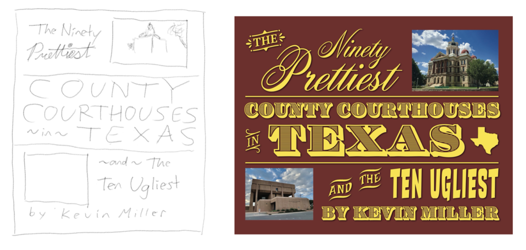
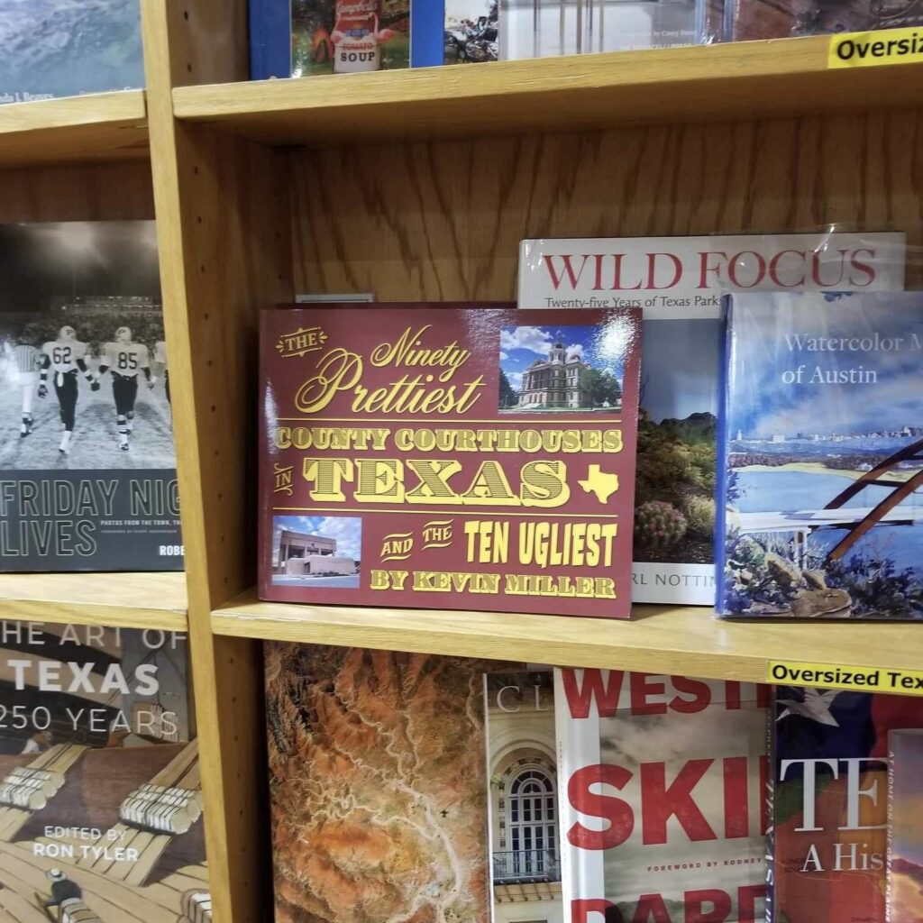
After settling with Kiki in Amsterdam at the end of 2020, I waffled on whether—more importantly, how—I should begin. One of my first actions was to mock up the cover, which started as an iPad sketch and changed surprisingly little over time.
The book’s title gave me my next assignment: make the ridiculously subjective judgment of which 90 courthouses are the prettiest, and which ten are ugliest. I had over 300 courthouses to choose from1 and zero architectural expertise to draw from. But the concept was tongue-in-cheek enough that I felt comfortable making gut decisions (and hey, if you disagree, make your own book). Some interesting trivia that emerged at this point: Texas has a surprising number of twin and triplet courthouses—even one set of quadruplets!
After some weeks I finally narrowed down my winners and losers into a nice organized spreadsheet. But I hadn’t even started making the damn book. It only took a few minutes poking around Adobe InDesign to realize that using it was going to drain my enthusiasm. Instead, I opened a blank document in Keynote—yes, Apple’s PowerPoint app—and started building a mockup, one page per slide, dragging around images and text boxes.
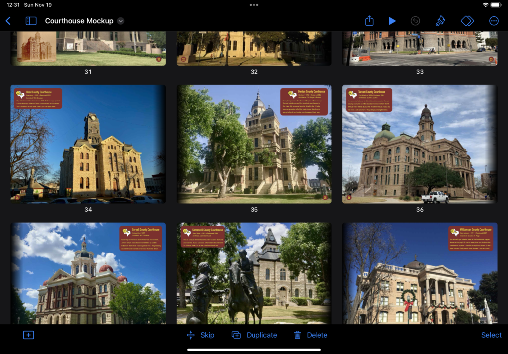
The fundamental questions began almost immediately. Would I be ranking the courthouses, and if not, how else would I organize them—alphabetically, geographically, etc? I made a hundred book-design decisions you would expect—fonts, color scheme2—plus a thousand that you wouldn’t, like how to format the index. My rationale for most of these is lost to time: why did I start the book with the East Texas chapter? Why did I put Travis County Courthouse next to Navarro County Courthouse? I don’t know, but I probably had a reason!
It was slow going, with weeks of inaction punctuated by short bursts of productivity. That’s how big projects go with me. After about a year, I had an “alpha” version of my mockup ready for review. This felt like a huge accomplishment, but it was still a simple thing—only a few of my photos even had captions! For all that work, it wasn’t much more ambitious than the aforementioned Shutterstock picture book. My reviewers gave great and candid feedback, which in summary said: This isn’t finished! Give us more!
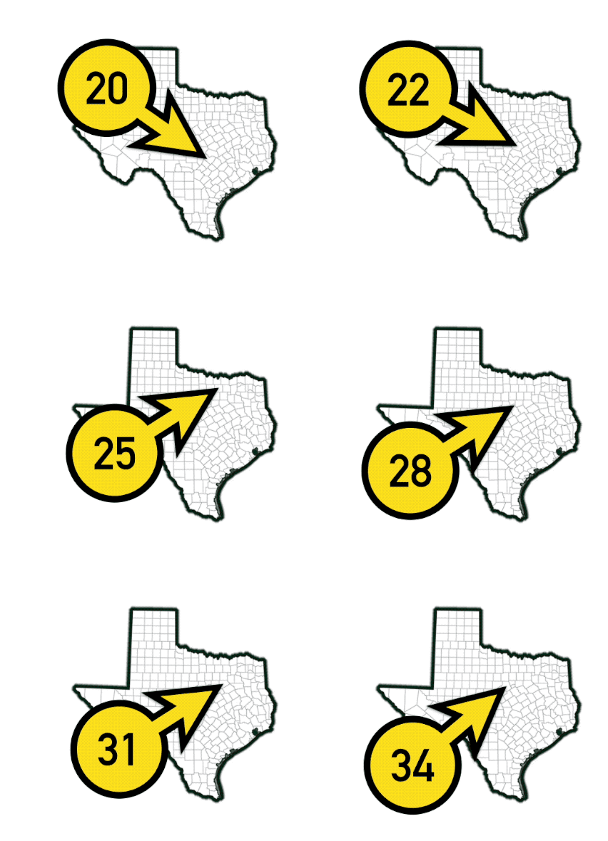
So I doubled down, researching and writing captions for every page, typing the phrase “County Courthouse” so often that I made a keyboard shortcut for it (“cch”). My productivity slowed to a glacial pace, but never quite stopped. I got through a second round of friend reviews and kept plugging away. There were obvious to-dos like the back cover design, plus weird little side projects like creating the maps and the numbered arrows pointing to all 100 courthouses.
There were still miles to go before I slept. But one happy hour in spring 2023, energized by my second beer, I decided in a flash that the book would be on sale by my birthday, June 30th.
Deadlines are motivating. I made design decisions on which I’d been hedging and checked and re-checked and re-re-checked every word and detail in the book. Amazing how many times you can glance at a typo without noticing it.
Meanwhile I made final edits to the photos themselves—that’s over 100 separate Photoshop jobs, and I’m not especially good at Photoshop. There are wizards out there who coulda made my pictures twice as pretty in half the time, but this felt like a “me” part of the project. I’d noticed that many of my photos were cropped a bit too closely—note to aspiring photographers: stand back!! But soon before going to print, I got a huge assist from our new robot overlords: Photoshop released an AI-driven “generative fill” feature that can expand an image beyond its original borders. While chuckleheads online were using it to stretch the Mona Lisa and whatnot, I was giving almost a dozen of my photos some breathing room. With any luck, you’ll have no idea which ones they are.
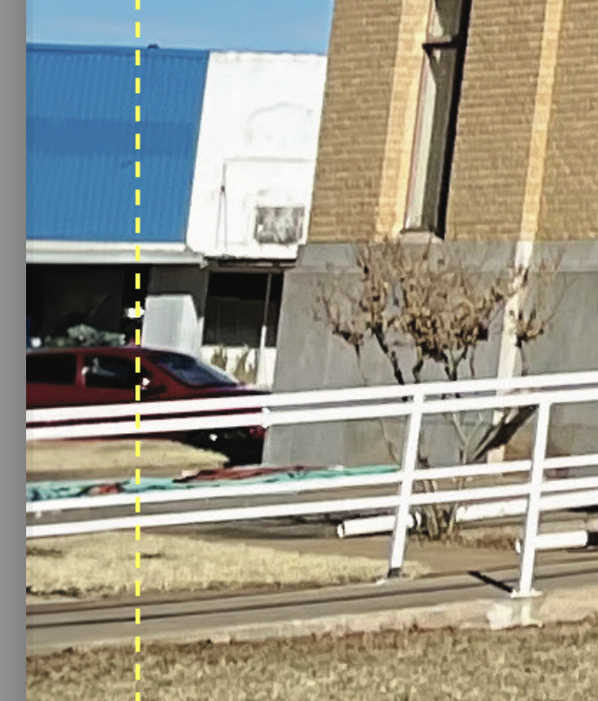
All that done, I hired a designer called Jennie on upwork.com who recreated my Keynote mockup in InDesign with incredible speed. Jennie and I went through five rounds of feedback as I refined it (see above about the damn typos). Example feedback: “Page 57: would you narrow the text box slightly so the word ‘is’ jumps to the final line?”
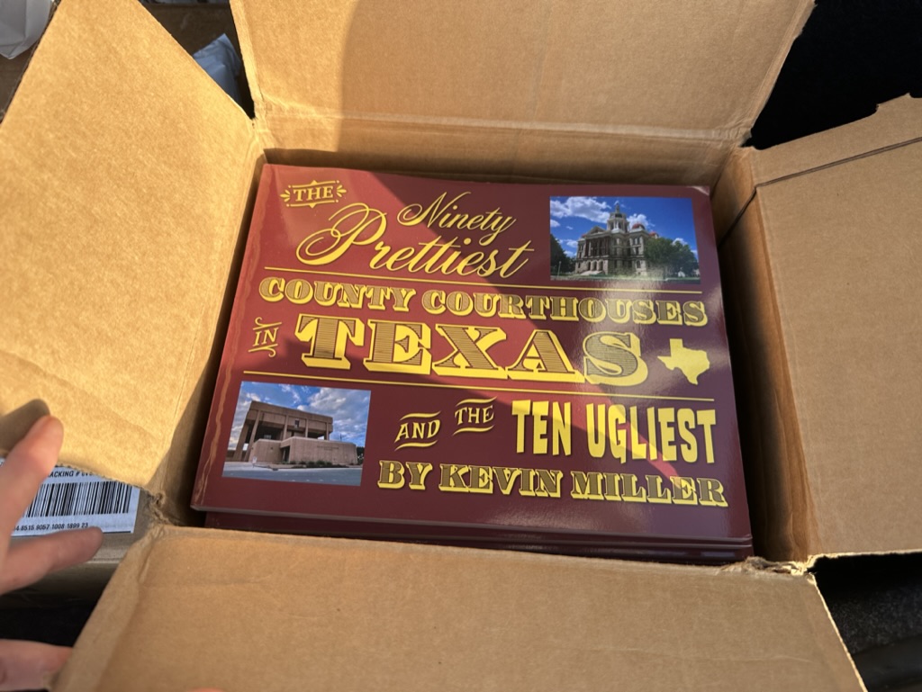
As Jennie and I finalized the design, I educated myself on self-publishing with IngramSpark, the most popular self-publishing platform. There were a dozen more hurdles too boring to get into, but the upshot was my trip to Texas in July, where I picked up a box full of copies of my very own book.
As we speak, my book is available on Amazon in paperback and hardcover editions. There’s sadly only one Amazon-free way to buy it, at BookPeople in downtown Austin. Full transparency: if you’re kind enough to order a copy, I’ll earn almost *one US dollar* from the sale! (You might’ve heard about the slim profit margins in the publishing industry. It’s a foregone conclusion that I’ll never make a profit on this.)
This blogpost is part of my very small promotional effort for the book. I sent a review copy to the Austin American-Statesman, and I’ll do some promotion to my 11,000+ followers on Ugly Texases, where there’s some obvious crossover appeal. Who knows? Maybe it’ll get noticed, picked up by a publisher, and become a bona fide hit.
But that’s all gravy. My first and only goal with this project has been a copy of the book for myself and whichever friends and family care to have one. Any time I want (which is often) I can pick it up off my bookshelf, flip through it, and say out loud: “I made this.”
You get a pass on the colors only because you said “burgundy” instead of “maroon.” Hook ’em!